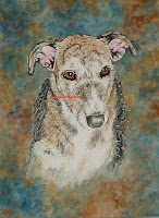
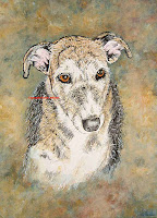
After completing the dog portrait in time for the Christmas deadline, (even with a stinking cold!) I’m all poised to get on with the next erotic landscape when I receive a call requesting that the two women who are involved with the painting – the “requester” and the “giftee”, (ie the woman who contacted me in the first place to order the painting and the woman for whom the present was intended) want to come and talk to me about the painting. Ok. Sounds sinister and I wonder what the problem is. It turns out, when they come to see me, that they love the portrait of the dog herself, and think I’ve caught her essence beautifully, and love her big soulful eyes and adore the painting EXCEPT for a slight alteration to the pinkness of the dogs ears BUT most importantly to the background. MMMm….. That was gratifying, that the only problem was in the background colour, and fortunately since the painting was done in acrylics it was possible to go over the colour with a different one (if it had been watercolour I’d have really struggled to do it and would probably have had to do the whole painting again from scratch!). So, what colour do you want? And it turned out, after they described colours to me, and I mixed up various shades to see that I understood the description of “more creamy greeny beige with a hint of yellow, but not too much, and not a lot of red or blue” that the colour they wanted was very similar to the colours of the dog. Mmm…. not a good idea and I explained why. That the colours I had originally chosen for the background colour complimented the dog, and made her stand out more, and made the picture more dramatic because of this. Yes, they understood this, but they wanted the dog blended in more to the background. Ok, I understand. But my problem was that I could see what the adjusted picture would look like, and needed them to understand it too before I started to change it and found that they actually preferred the original version! So, I painted them a couple of little thumbnails (small, indistinct sketches to show basic colours and basic tone as a guideline for how the paintings would differ). They stood and watched me as I did it and were still adamant at their decision. Ok. I’ll do it then and contact them when I’d done the alteration. I made notes as to their request and had a full understanding of exactly what they wanted….
…..And that was the strange thing. Because I was perfectly happy with the original painting. I had chosen the colours with care, and matched it all perfectly. It balanced as a concept, as a painting, tonally and colour wise and I had painted it on my creative gut-reaction based on years of experience, every workshop, and art course I’d attended, every art tutor I had listened to, every book I had read, every piece of art I had seen and NOW I had to overwrite all of that with someone elses concept, and you know what? It was difficult. I had to ignore my own creativity and go with someone elses input. Plus I had to make the image look like it was originally painted like this, and keep it fresh so not over-paint it and make it look “tired” or strained or false. Mmm…. difficult. So, time to do it, and I got on with it. Painted over the background with the new colours, forever changed to the new colours, and I stood and looked and looked and looked at the new colours and wasn’t at all sure that I was happy with them……… but I reframed the painting, rang the two women and awaited their arrival…..
.jpg)
+(2).jpg)
I like the lighter one, makes the dog stand out more.
Vi – I can see I’m going to be in the minority over this one…! lol
Original doggie for me. I like the teal blue elements in the background. They bring out the colour and texture of the fur, which is why you painted it like that in the first place.
I can see this being a long running debate!
Love the title “Background interference ” No .. I’ve studied the two portraits and my instinct tells me the first one is the better of the two, just to confirm.. the darker painting. The lighter one does nothing for the pooch… in my opinion anyway!
Racy redhead – Yep, you’re exactly right, that’s why I painted it like that in the first place.
Indigo – Thanks, I was happy with the title too! And thanks for your comments re my background colour choice.
I like the darker version. It gave me the impression the dog was outside in autumn. However, the lighter one may blend better with the recipient’s color scheme. Not particularly a good way to buy art.
Glad they were both happy with the re-finished portrait, Jackie.
Good Sunday afternoon Jackie.
The first version on the left is more dramamtic, and if the second version is what rattled their cages, well, okay. As long as they paid for it including your revisions. Either way, the dog looks good.
I wish you didn’t have to alter your art for someone else’s sake since I think your original instincts were correct as to color, but… I guess that’s part of the business.
I’m glad they were happy ! Hopefully it’ll lead to referrals and more business as well.
Nitebyrd – I think you may be right regarding the background matching the color scheme. It was particularly the blues of the original painting that the recipient didn’t like.
Loving annie – I’m pleased that the dog looks good and it was only the background I had to change. It’s very rare for me to have to alter something like this because normally I have a very clear idea of what someone wants. In this case the first woman was trying to choose on behalf of the recipient, who obviously had other ideas! Hence the changes. But hopefully I might get referrals, especially when I complied with the requested changes, and they were so obviously delighted with them.
Jackie…nice nipple!
Anonymous – Er, I think you’ve lost me……….
Do you paint Boston Terriers? Ron Adshead Seaford,DE
Tileman – I’ll paint virtually anything – why? Is there something you want doing?
Comments are closed.