A few weeks ago I realised I wanted a ‘wow painting for my lounge wall, and mentioned it to my husband, since the choice would affect him as much as me, as we’d both be looking at it! I came up with a few ideas and told him my suggestions, and then decided on one, it was the right subject, was something that I would thoroughly enjoy painting, and certainly looking at, and I knew my husband would too..
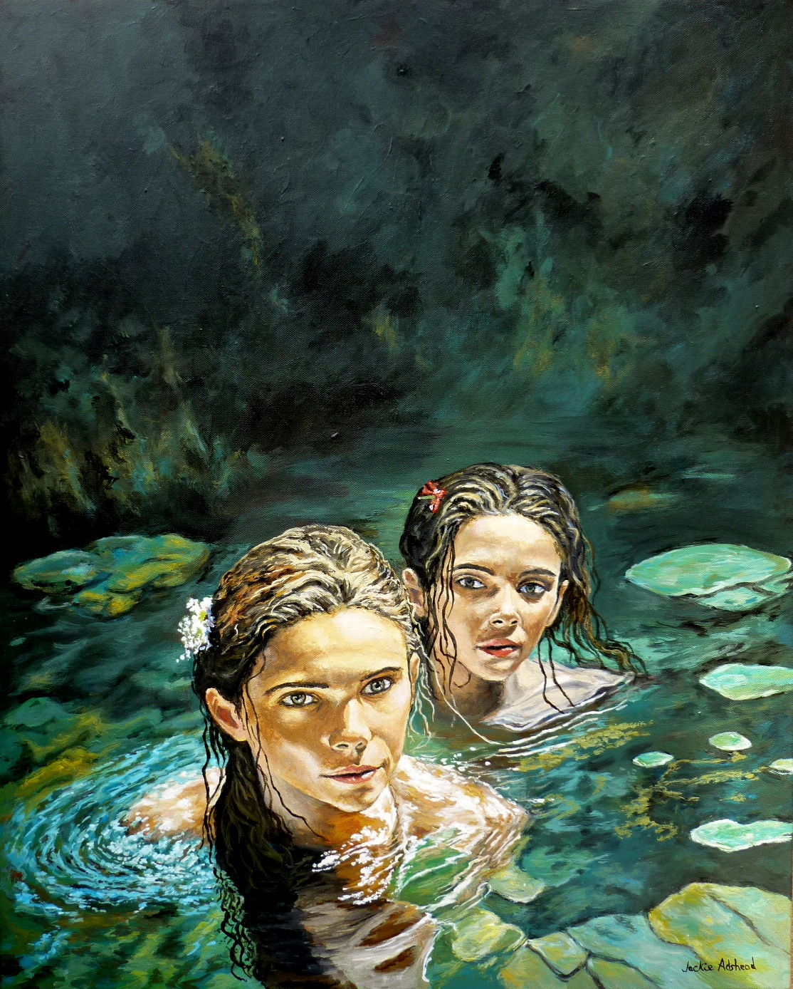
The subject was to be two of my favourite things… Beautiful women, and water. So the obvious thing was to have the women in the water.
I wanted the image to be vertical because it fitted the space it was to hang on better than a horizontal one. I had a canvas 24 x 30 inches and felt that would be ideal for the picture. I drew out the basic shape onto a piece of paper so that I knew where the two womens heads would fit within the image.
I blocked out the basic tones of black for the area above the women, and the green of the waterlily pads, and rock to the left hand side just above the main head. Then spent many hours fine tuning the water, as it had to show the fluid depths of the shallow stone in the foreground, as well as the stones in the water around the women, and hint at the depths of water behind them, and the ochre drift of week on the surface and the reflections of the ripples, and surface foam… theres a lot going on in the water, which is why I adore the challenge of it!
I wanted the dark above the womens heads to have a mix of the turquoise blue, yellow ochre, burnt sienna, and hints of black within it, rather than a flat black which would have looked dead and boring. Those colours also feature in the rest of the painting, so it makes it more harmonious. The loose marks hint at stone, and moss, and dark water.
When all that was done, then I could concentrate on the womens faces and hair and the flowers in them. I did the woman on the right hand side first, as she was secondary to the woman in the foreground. It was also a nice challenge to paint her in the water, and the black of her hair with hints of light in it giving it interest and shape and form.
When I had done her I then painted the woman in the foreground, her face and hair and then the light bits of hair that were in front of the other woman, and added depth to the image. I liked the way that her hair was black on one side, and ochre on the other, showing the depth of shadows and light within the picture.
It was only when I had finished the main woman in the foreground that I could complete the turquoise refections and white foam around her shoulders.
The painting is in acrylics on canvas (measuring 24 x 30 inches) and is called ‘Come on in’ … every time I think of that title, I want to complete it by saying… “The waters lovely..”.. so thats a good reaction isn’t it!
I absolutely love this picture. its turned out even better than I hoped… its just what I wanted.. a ‘Wow’ painting for me…. and my husband really loves it too…
It makes me want to go swimming…. lol