The client who last week wanted me to do this pen and ink drawing as a gift for Christmas for a member of his family gave me plenty of photos of the house to choose from. He didn’t specify which I was to use, and left it to me to decide which I would. All the photos were nice and clear which always helps me as an artist.
But what he did want me to do was match it in style and concept to another pen and ink drawing done by another artist of another house that his family used to live in. Fortunately he gave me a photo of that drawing too, so I could see exactly what he was referring to. I’ve done a lot of pen and ink drawings, and love the way that buildings lend themselves to this style so beautifully. The way the other artwork was done was similar to my style, but slightly different, so I had to look very closely at it to make sure that my new drawing would match the style of the other one.
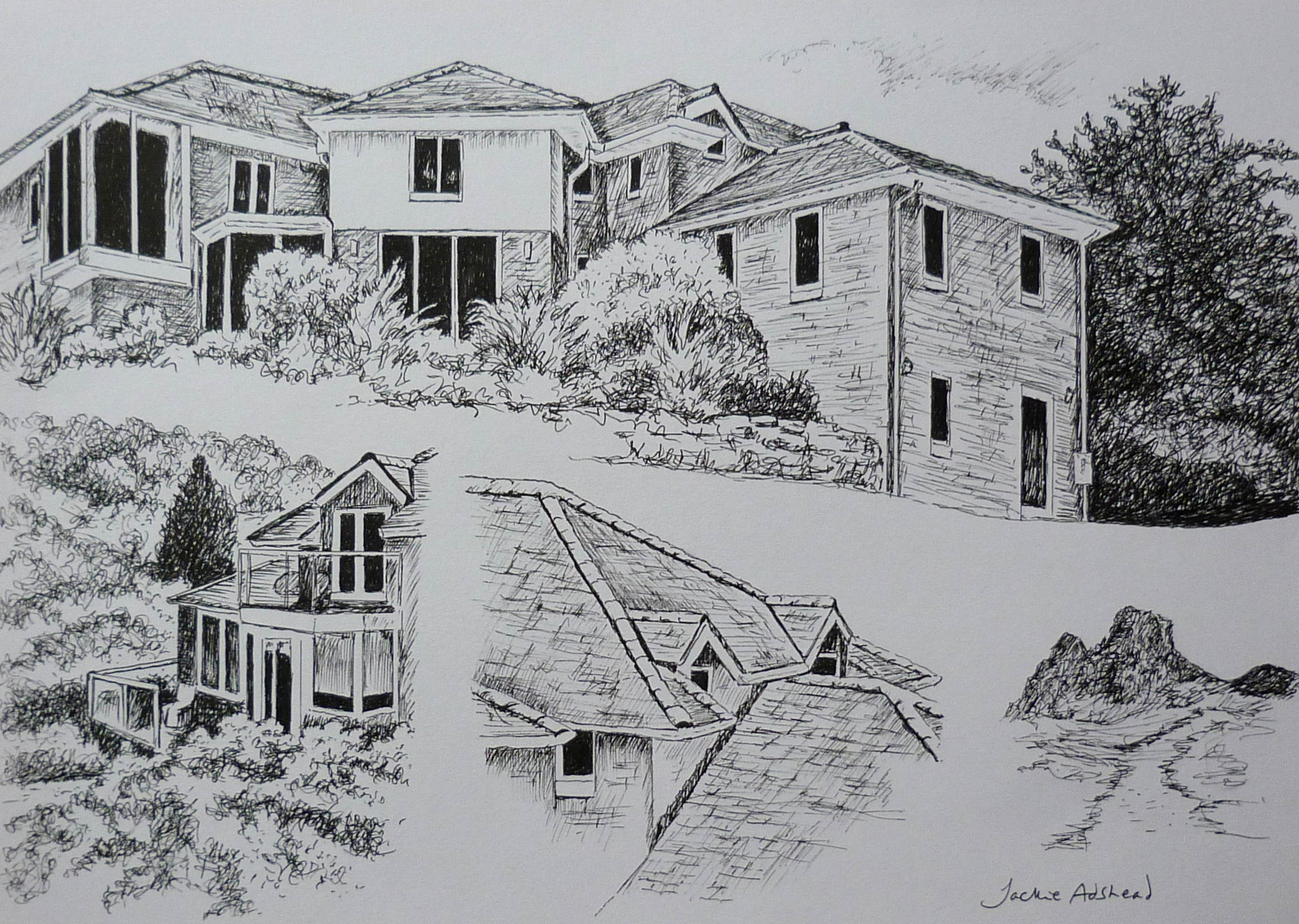
What I liked was that at the top half of the drawing was on a slant across the page of the length of the house with doors and windows, roof and foliage to the side, below it the image was split into three, with a corner of the house in the bottom left hand side, the roof line with chimney in the middle, and on the right hand side a detail of the house.
The photos I had been given to work from had two that would suffice for the top image, one that was perfect for the corner in the bottom left, but there was no chimney to match for the middle image so I decided to use the roof detail of the dormer windows, and for the right hand bottom the client had asked for ‘Gaerestone’ (I’ve no idea where this is, but apparently the house is named after it).
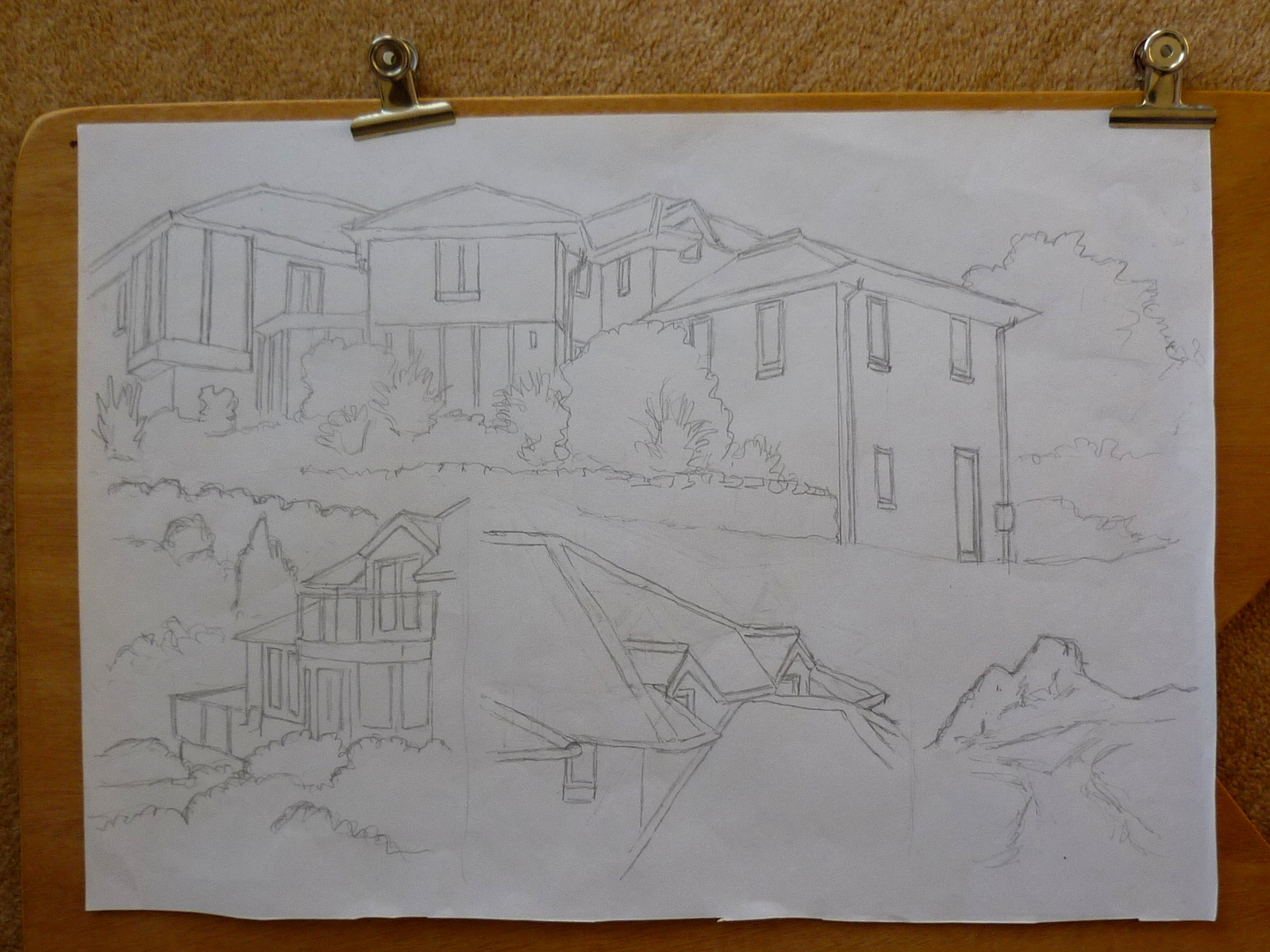
The client and I had agreed the drawing, the size (A3), medium (pen and ink) cost, and time frame (as quickly as possible in time for Christmas!!) but what I didn’t want to do was a lot of drawing and find that the client expected it to look different to what I was envisaging, so I did a working drawing in pencil on A3 (16 x 11 inches) sketching paper, just the outline of the best artistic way to put the images together, and emailed the image to him for his opinion. He was happy with it, so that meant I could start the more detailed version of the working drawing, so that he could see how the layout would look. I sent him that image by email and he told me he was happy and that meant I could start the pen and ink drawing properly on the lovely cartridge paper that is ideal for these drawings.

I got the outline drawn out, then over the next two days filled in the dark tones, as I had to make sure it matched the other pen and ink drawing in style (the layout captured the four aspects of it beautifully). The thing about these sort of drawings is you can’t rub anything out, if you make a mistake you have to start all over again, and if you spill your mug of tea on it, it shows!! …so I drank my tea very carefully keeping it to the side of me as I drew the drawing.
On the second day I looked at it fresh and loved the way the image was coming to life. On the third day my task was to make sure it MATCHED the style of the other pen and ink drawing of the other house. I had to exaggerate some aspects that I wouldn’t normally have done, mostly in the dark of the windows, and foliage in the trees to the side of the house. The client had asked for it to be drawn in a loose style, which is easy to do especially for the foliage around the house.
When I was happy that I had done the drawing I emailed the image to him for his opinion and feedback and was delighted that he said it looked great and paid me the balance of the money he was owing me. I thanked him and said I’d get it wrapped up and in the post the next day.
I loved the way the client said …“Framer is all lined up. Thank you for your excellent work and speedy delivery. I will get you a photo of it with the unwitting recipients for your blog. “
I’ve really enjoyed working with him, I’ve loved doing this drawing, I love the concept, its a good feel of a house, even though I’ve never seen the house in real life, I know I have captured its essence in this pen and ink drawing. And I know the design is interesting the way that its divided into four aspects slanted across the page.
