Its been a couple of weeks since I got back from my holiday in France and I’ve caught up on house and garden jobs, which means I can get back into focusing on art. And being an artist…
Sometimes I have commissions to work on, and sometimes I have ideas for artwork I want to do but in this instance I hadn’t. So that meant finding a painting that I would find inspirational from a photo I already had……..
And I have hundreds of inspirational photos…
So which one would be the best one….
After a search through them I decided I would like one that featured blue skies, trees, water, and preferably a bridge of some sort.. and then I remembered a walk I went on a few years in Staffordshire, just north of Burton on Trent, which had a lovely stream
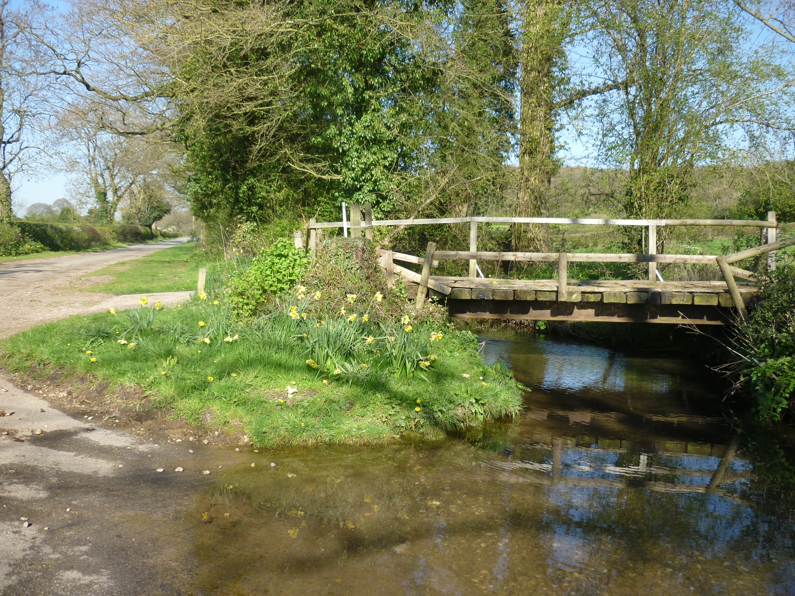
This was the source photo I worked from, there was nothing I needed to change in it for my painting, which meant I could concentrate on the fun, arty, creative bit!
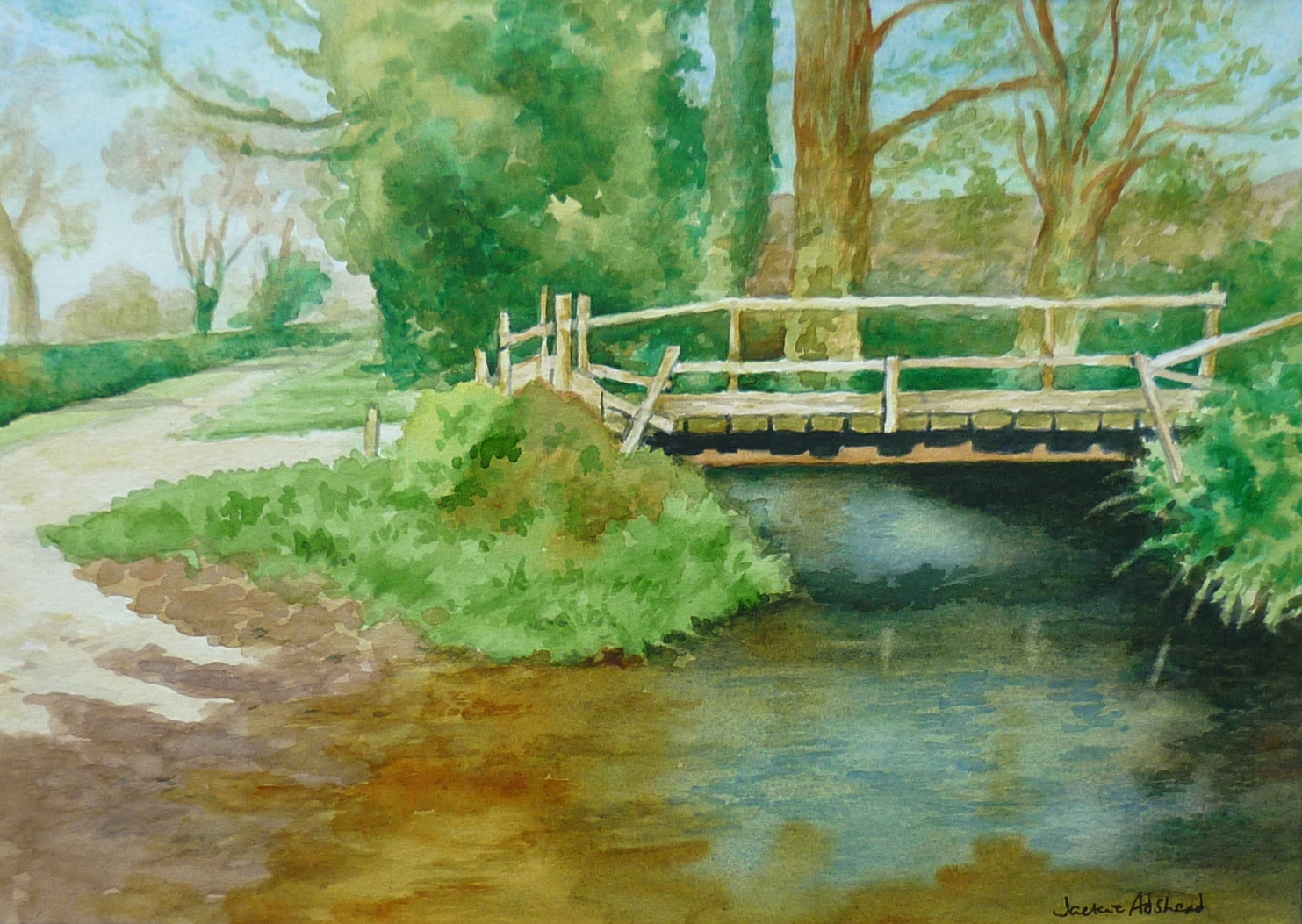
I drew it out, didn’t bother to measure anything. as I knew my watercolour painting was a bit wider in comparrison, so I just drew it to fit the paper. And then just painted it, the pale blue sky first, then the paler trees on the left hand side with the hedge below them, (using the same faded colour for the hill on the right hand side) the country lane disappearing out of sight, then the clump of green trees, then the three specific trees above the bridge. When I was happy with that I painted the clump of grass in the middle of the picture and the darker pinky colour of the wet ground leading into the ford. The clump of grass on the right hand side was next. Then I painted the water in one go, from the dark black colour, the faded blues, the faded greens, the warm golds that join onto the pinky wet ground on the left hand side of the foreground. It was only then that I painted the bridge itself..as I wanted the wooden struts to stand out, so the background between them had to be darker for that to look right. The dark shadows under the bridge timber help to exaggerate the pale wood too. I also added harmony to the painting by using the same gold colour in the two right hand trees, as the clump of grass on the left hand side of the bridge, and the water below it.
I’m really happy with the painting, and didn’t need to hint at the daffodils in the photo.
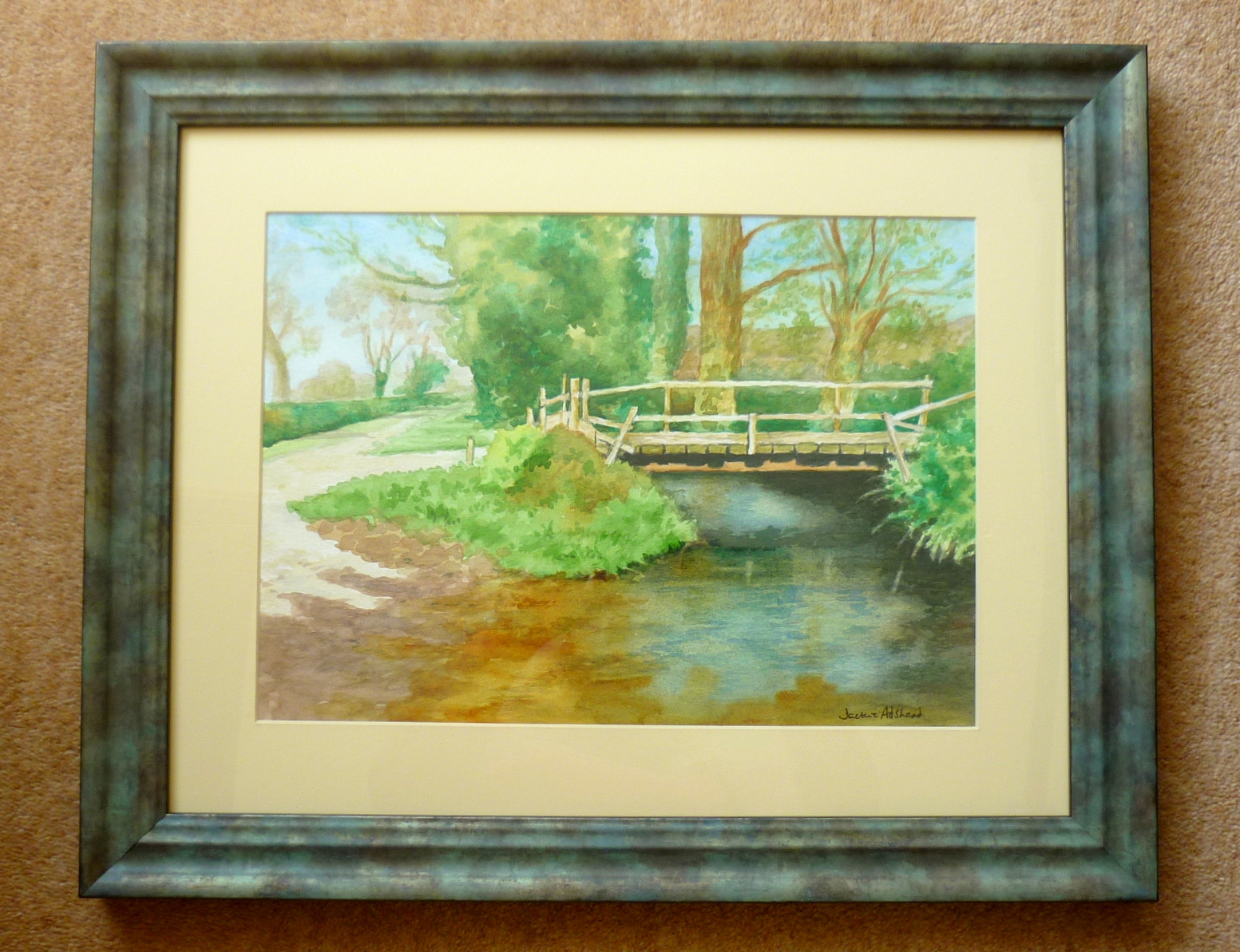
The painting is 14 x 10 inches and is called “Refreshing greens” and you can see the painting in the frame below..which also adds to the green theme!
And I am now inspired to paint more water and bridges..because I can think of two other photos I have of the same theme….but in Kent…