When I first saw the photo of Mike in his swimming pool, I instantly reacted to it. I love turquoise, I love light on water, and the photo had both in abundance, so it wasn’t surprising that it was something I fully wanted to paint. I loved the way that the guy in the photo was so backlit by the sun behind him that his face and features were in deep shadow. It made the photo more abstract and appealing than the usual sun in your face photo and there were some lovely lines in the water from the reflections that added so much to the picture. Water is soooo difficult to paint, as there is the surface, there is the light through the water, and there is whatever is on the bottom. The fact that the sunlight was so bright, searingly bright w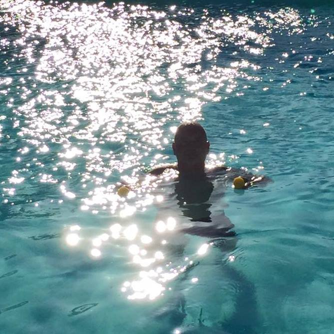 hite in this photo was a joy to me, and all the surface ripples and movement made some gorgeous colours and tones of turquoises from deepest dark to almost limegreen. I loved it!
I made a half serious comment to Mike that it would make a good painting and he reacted jokingly with “How much, Jackie!!?!” which made me smile. The answer he got was – Whatever you want it to be, I can paint to your budget – do you want Lidl prices, Tesco prices, Waitrose prices, or Fortnum and Masons?” which made him smile. He went away and had a think about it, and whereas I am not going to tell you the price, I will say it was mid-range.
I had a commission to paint!
I ordered the canvas which arrived the following day, along with some deep turquoise acrylic paint. I already had the other acrylic colours I needed but not the deepest turquoise I was going to need for the gorgeous depths of this painting.
The canvas was 20 x 20 inches square, a block canvas with the edges to be painted too, which gave me lots of room to get all the fine details of this painting. Although technically it was just a man in water, it was FAR more complicated than that. Far more! It was a man, in shadow, partly covered by swirling water, partly covered by bright sunspots of white as well, and although the photo had been taken at the side of the pool looking down on him, it had such depth of focus that the pool behind him was almost deep greeny-blue, the pool in the middle was a mid turquoise, and the pool infront of him had far more reflections on the bottom that made interesting shapes and shifting colours. All of it had to pull together as water, a solid mass but transparent. Also, the light spots on the surface also made their own fascinating patterns and shapes as well. So, all of that had to be drawn out first before I could get anything painted in.
When that was done, I started at the top of the canvas and painted down from dark to mid, to light tones. Then started to build up the colours with glazing effects – thin coats of transluscent colours over the top of each other, brushed over to make the colours merge and give harmonious unity. When that was done, and it took quite a few hours to get that right, I could start on the man’s head and reflections in the water, which were different to the ones of just the water. These had purples, and deep magentas, burnt sienna, cadmium yellow and turquoise mixed with white.
When I was happy with all of that, I did the yellow outside edges of the sunspots in the foregrounds which would make them stand out more than the ones in the middle and far part of the pool.
Then, when all of the colour was in, it was time to do the last, and really important part – the white sunspots. All were done in one go, painted in separately as the shapes they were, lying on the surface of the water, roundly elongated in the foreground, flattened in the back ground and a frothy foam in the middle. Difficult, but so worth doing the drawing of them in the first place to make sure it looked good. 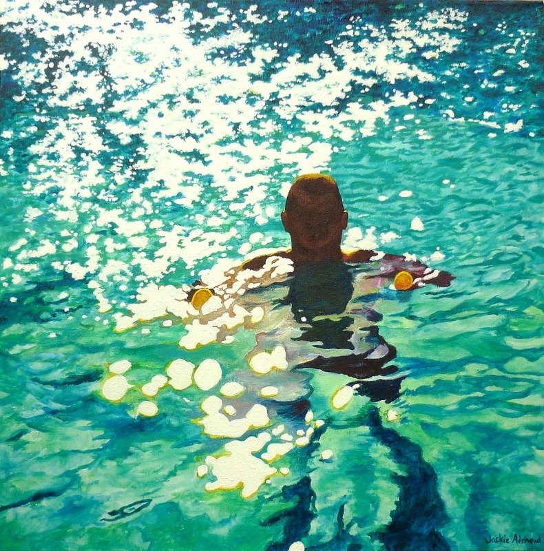
There! Done!
I was delighted at the effect, and love the way the painting has picked up all that was good in the photo but also added a little bit of extra, as paintings do, of the essence of this gorgeous painting – of a man in his swimming pool, with the sunshine beating down and the cool water so fun to splash around in. Its entitled “Mike in Eureka swimming pool” and I’ve shown the original photo that I loved so much, along with the block canvas painting that I did from it.
This is lovely. The colours in your painting are stunning.
Aww thankyou! So glad to hear you like it. I will also add as I’ve said before to you that the colours in the painting are actually far clearer and brighter than a photograph can ever depict.. but it least it gives a good idea! 🙂
I totally agree. It’s much more beautiful than the photo for that very reason.
Yes well that’s why a painting shouldn’t be a total copy of a photo, it should bring out more of the depths of colours, more of the contrasts, more of the composition, to make the painting more of the image than the photo can ever be!
Really like this. Love the water reflection. Great.
Awww thanks Mark, it was difficult to do but I’m really pleased with this painting!!
Stephen Harding liked this on Facebook.
Pip Wheelwright liked this on Facebook.
Mark O’Connor liked this on Facebook.
Trinia Stenson-Walker liked this on Facebook.
Coral Farrell liked this on Facebook.
Miranda Jane Lawton liked this on Facebook.
Comments are closed.