Back in July when I took the photos of the poppy field in Kent, I knew I wanted to do a painting of them as soon as I could. So when I found that the art workshop that I went to at the weekend was entitled “Poppy field in acrylics” I realised that this was the time to do it! I knew that the tutor would probably take source photos for us to work from, but I was going to take my own to produce something more individual.
The tutor’s field was in Provence in France, mine was in Kent in England, but the method was still the same.
We started our paintings by brushing over the whole of the board mainly with scarlet red touched with orange in the foreground, fading up to vivid orange as it got to the sky area. This flat covering of paint then took away the scary aspect of starting with a white background, and started the vibrant base colour of the picture. When it was fully dry, and acrylics dry very quickly, then the features of the landscape were sketched in, the background hills, and outline of the trees in the middle of the field were all I needed to draw. Then I painted the azure sky with a large flat brush using cerulean blue mixed with white, painting over the orange underneath it, giving more warmth to the sky area. With a smaller flat brush I painted the distant hills, hedges, and trees making the horizontal line at the back of the field a really dark grey to give more contrast to the lime green where the field starts. I used the thin edge of a palette knife to apply the thin line of lime green where the field starts, then a smear of red poppies below it working the colour down to the line where the base of the trees and their shadows cut across the painting. When that had dried, I could then paint the trees in the middle of the field. The important part of them for me was the black trunks and deep shadows of the trees against the red of the poppies behind. The trees were painted with the palette knife using thick black paint, and when that had dried, I used a sponge dipped in a mix of green and yellow paint to make the delicate foliage over the top, using the tips of a brush to form the foliage in the thicker leafy areas. The white of the elderberry flowers was put on with a palette knife as it was part of the focal point and I wanted it to be a crisp white.
Then it was time t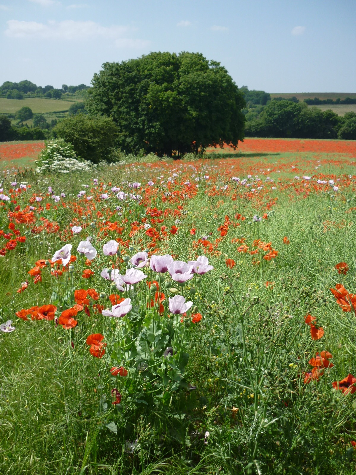 o start with the rest of the painting, which was the field of poppies as they grew through the field stretching ahead of me. At this point, most of that area was the base red, with some orange areas, but I had to finish this part at home a couple of days later, since I had run out of time at the workshop. The tutor wanted us to paint green and yellow over the red to make negative shapes of the red of the poppies, the poppy blooms getting larger the nearer to the front they got. Whilst I liked his effect, and finished painting, it wasn’t how I wanted to paint my poppies. I wanted them to be less abstract and more specific. I had also made the decison, that although I really liked the mix of mauve and red poppies in the field, I wanted my painting to be ju
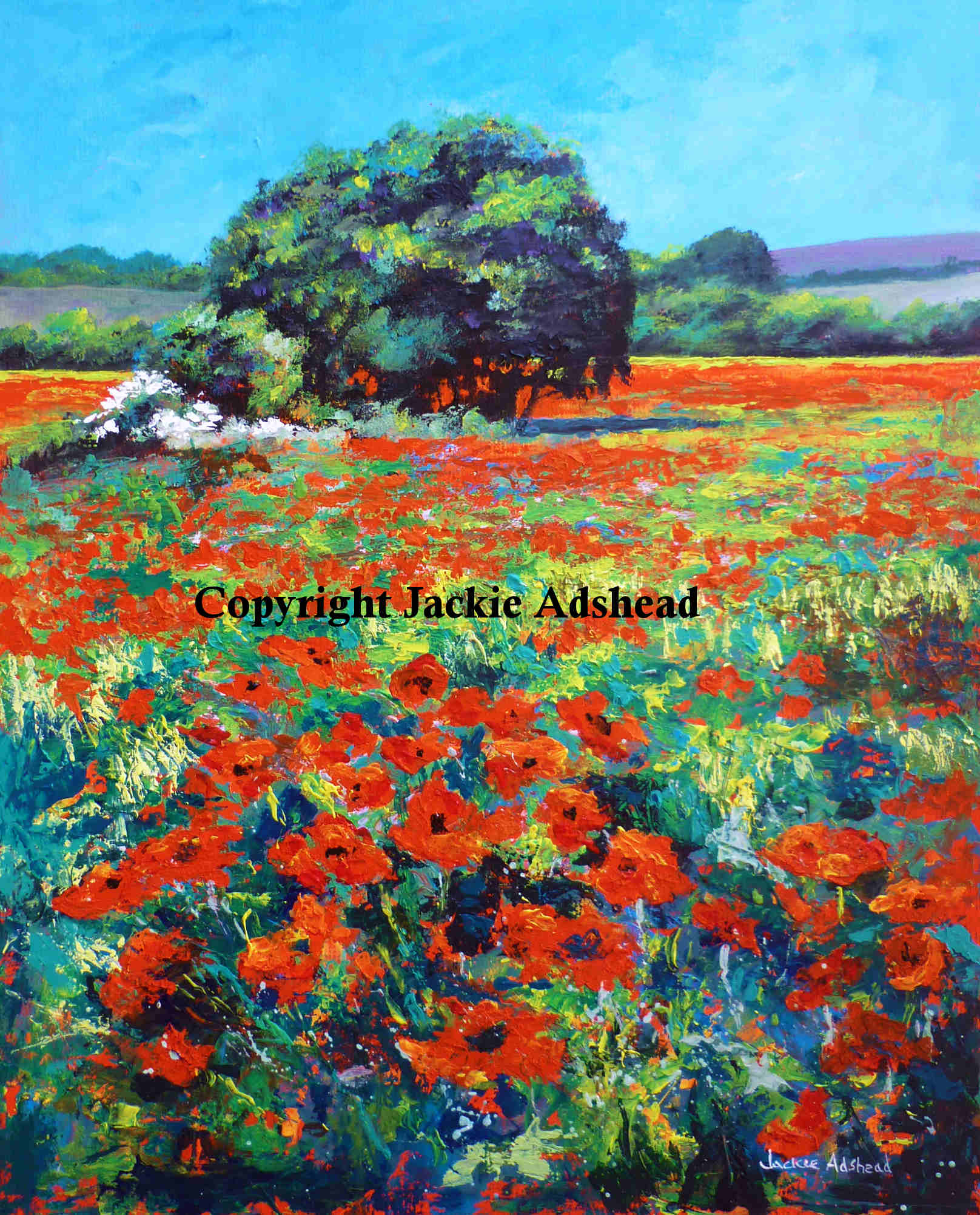 st red poppies as a better contrast against the green of the leaves. The difficulty was to make the distant blur of red of the poppies merge into the mid ground blobs of the poppies, leading into the individual heads in the foreground. And also putting in the vertical lines of the yellow and green crop adding interest as they also break up the redness of the poppies. The tutor had shown us many different and diverse ways of using a palette knife, utilising more ways of mark making than I’ve ever seen before! He showed us how to apply the paint with the flat of the knife, placing it with a measured pressure, and also smearing it across the paper, and with the side of it (for thin lines) the tip of it (for small round shapes), twisting it around to make rosettes, applying two or three colours to merge them in a thin smear, adding blobs of small colours to make a repeating pattern (like potato stamping), making negative shapes by applying the paint around the edge of a shape then filling in the gaps, using the edge of the pointed end to scratch out wet paint over the top of another dried colour below it, and flicking it to make splattering. It was great fun trying the different effects and seeing how they could add interest to a painting. I used most of the effects in this painting – placing, smearing, the side of it for thin lines, the tip for small round shapes, and scratching out wet paint over the dried colour below, splattering, all adding greatly to the liveliness within this painting. All the poppies are painted that way, from the distant ones, to the more specific ones in the foreground, which gives lots of interest and diverse texture to the picture.
I am delighted that I have created this vibrant painting from my favourite photo taken that day and have decided to call it “Poppy appeal” both for the appeal of the beautiful poppies that summers day, and for this week, being close to Rememberence Day on 11th November. The size is 20 x 16 inches, and it has shown me what stunning effects a palette knife can create in paint.